Portfolio
Strategic projects that moved the needle on design systems, accessibility, and developer experience.
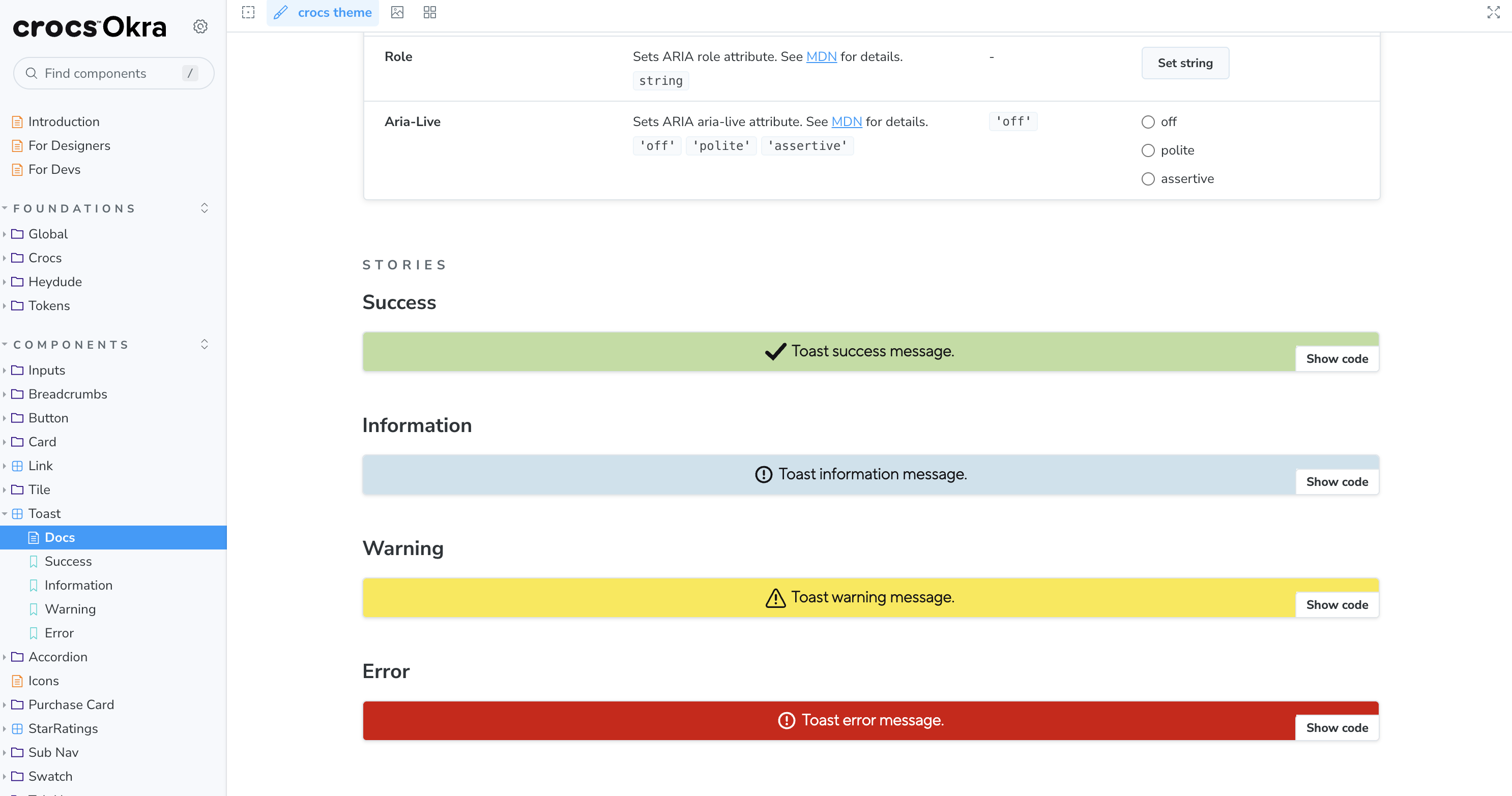
Okra Design System
Principal Architect for multi-brand design system serving Crocs and HeyDude with 40+ components, design tokens, and WCAG compliance.
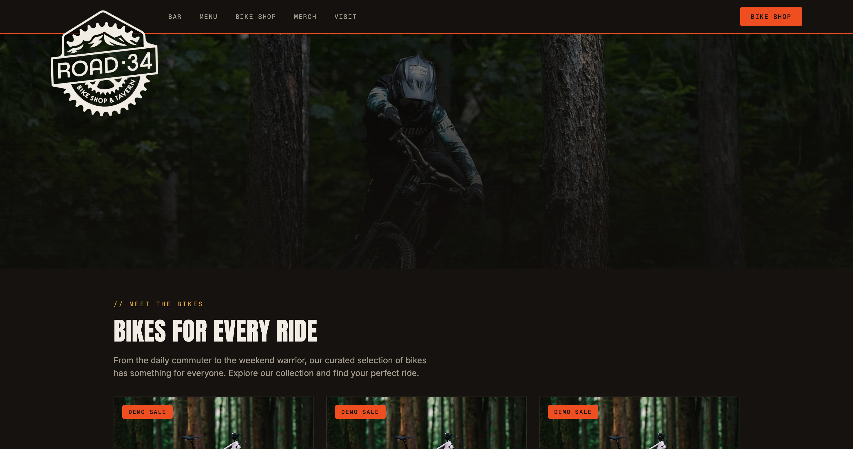
Road34 Redesign: AI + pen.dev + Sanity
Rebuilt Road34's marketing site using AI scaffolding, pen.dev for design exploration, and Sanity CMS for content management.
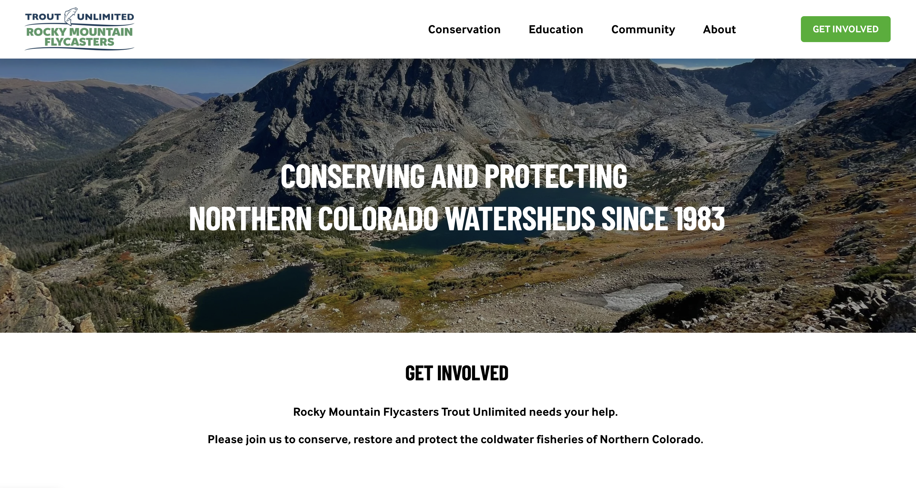
Rocky Mountain Flycasters: Squarespace Component System
Built and actively evolving a reusable component system for rmftu.org within Squarespace. Currently finalizing site styles aligned with National Trout Unlimited brand guidelines to solidify the RMFTU identity and modernize the visual presence.

AI-Scaffolded UI: Interview Prep Workflow
Developed a rapid prototyping workflow combining AI scaffolding, React implementation, and pen.dev design polish for interview prep.
Design Token Architecture & Multi-Brand Support
Built a scalable token system supporting two brands (Crocs, HeyDude) with Style Dictionary, enabling runtime theming and brand-specific overrides.
Component Accessibility: Building WCAG-Compliant Components
Systematically designed and audited components for WCAG 2.1 AA compliance with keyboard navigation, ARIA attributes, and automated testing.
Storybook-Driven Documentation & Design System Publishing
Architected a comprehensive Storybook documentation system linking code, design tokens, and Figma specs as single source of truth for 40+ components.