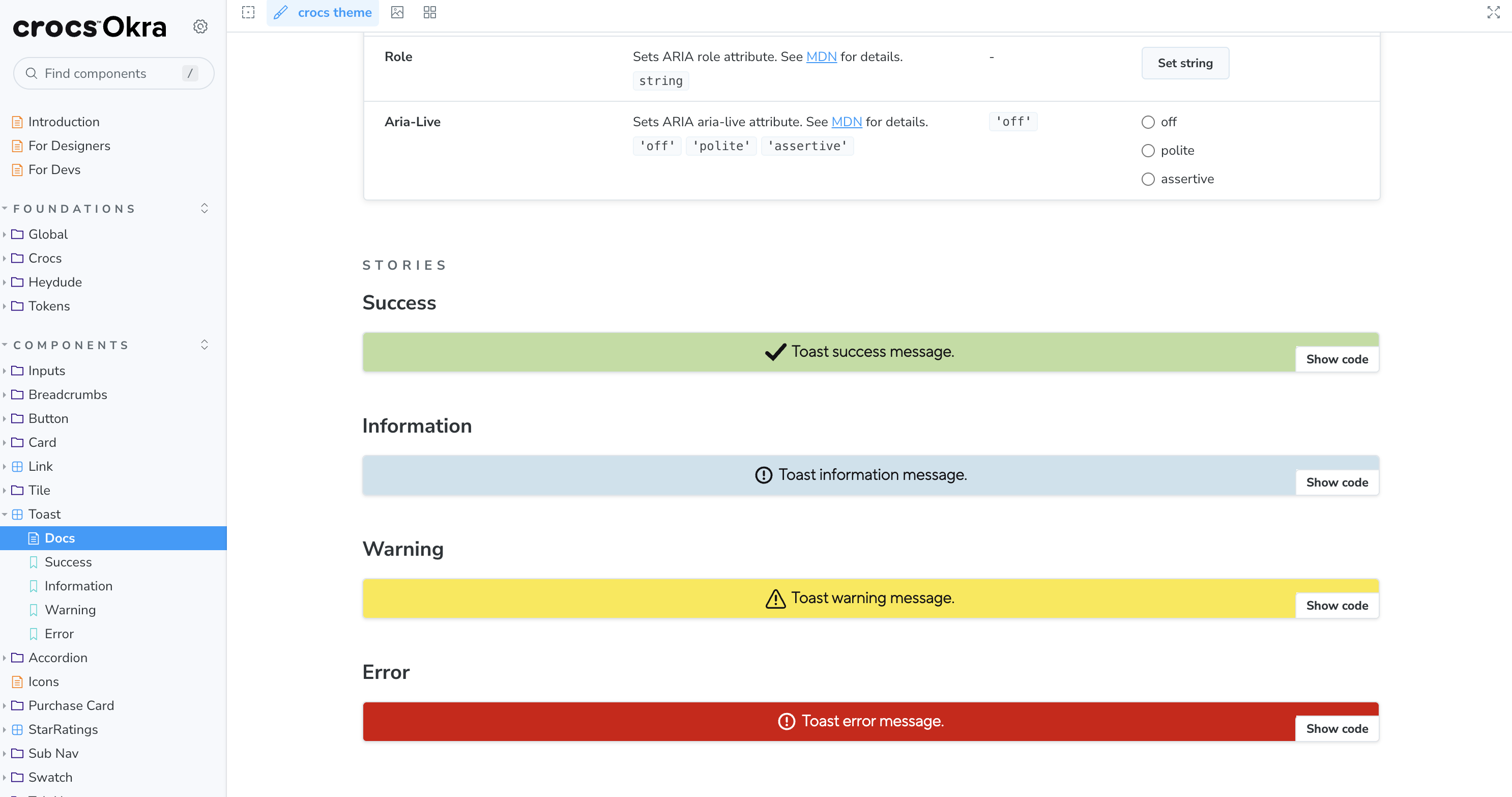
Okra Design System
Principal Architect for multi-brand design system serving Crocs and HeyDude with 40+ components, design tokens, and WCAG compliance.
The Challenge
Crocs and HeyDude needed a unified, scalable design system that could:
- Support multiple brand identities while maintaining consistency
- Enable designers and developers to work from shared foundations
- Provide accessible, reusable components for global storefronts
- Streamline the design-to-code handoff across teams
The Solution
Designed and architected Okra, a comprehensive design system built with modern web standards:
Tech Stack:
- React 18 + TypeScript for component architecture
- Style Dictionary for design token management and multi-brand support
- Storybook 7 with MDX documentation
- SCSS with CSS Modules for scoped styling
- SVGR/SVGO for optimized icon generation
- Webpack/Rollup for bundling and npm distribution
Key Features:
- Multi-brand token system: Separate brand tokens for Crocs and HeyDude with easy switching
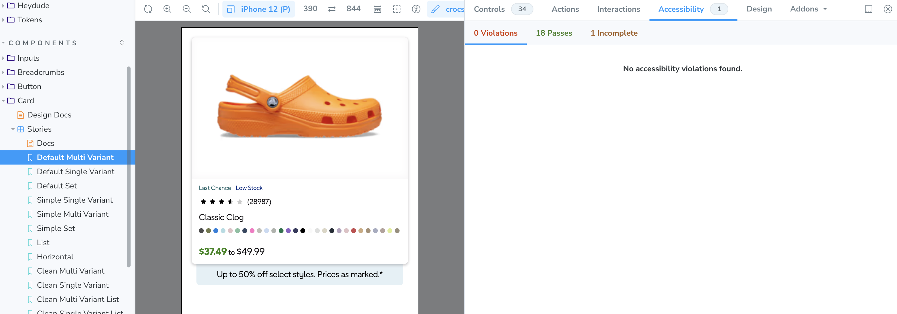
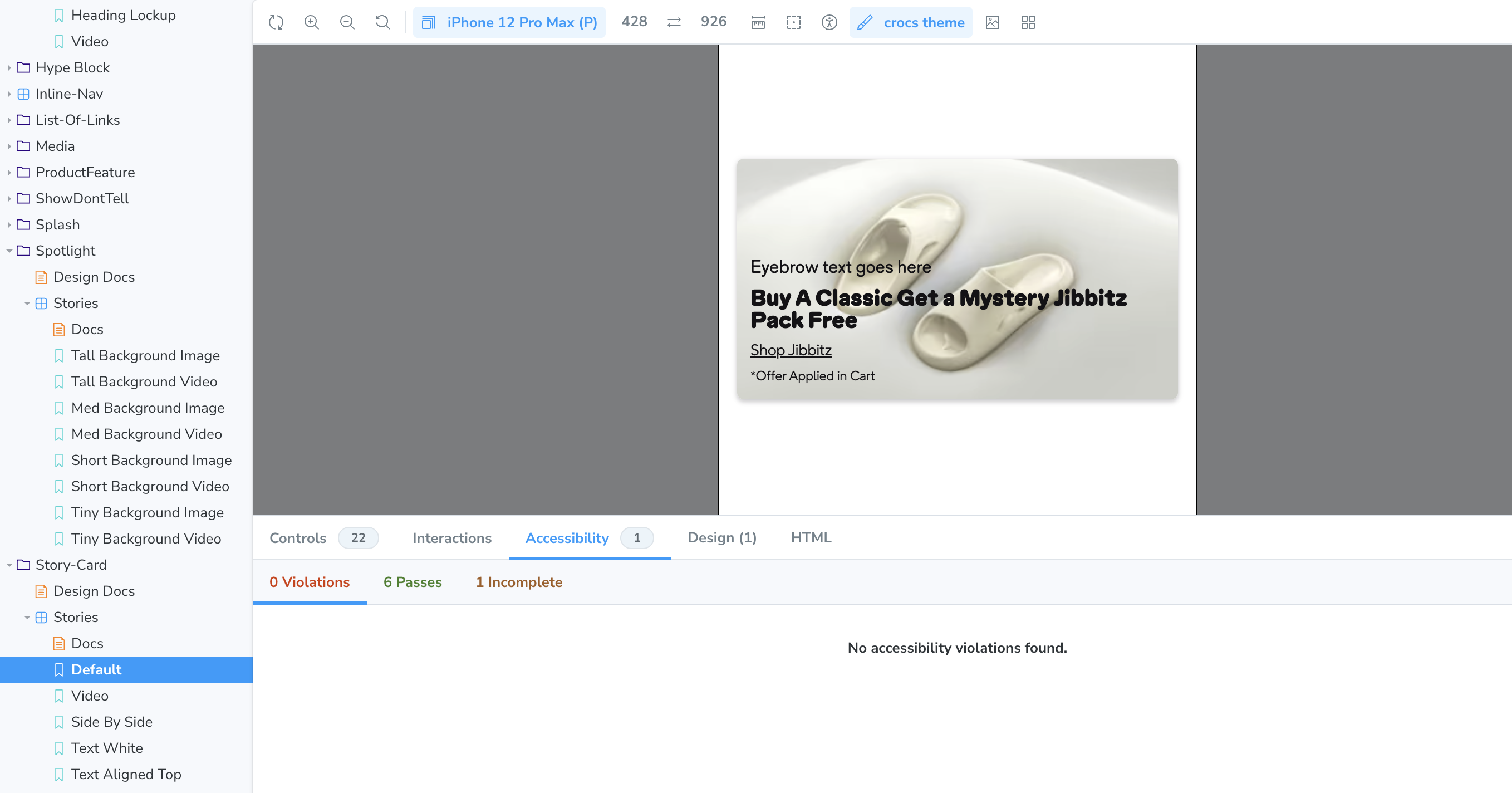
- 40+ accessible components: Button, Card, Link, Upsell, Spotlight, Hype Block, and more
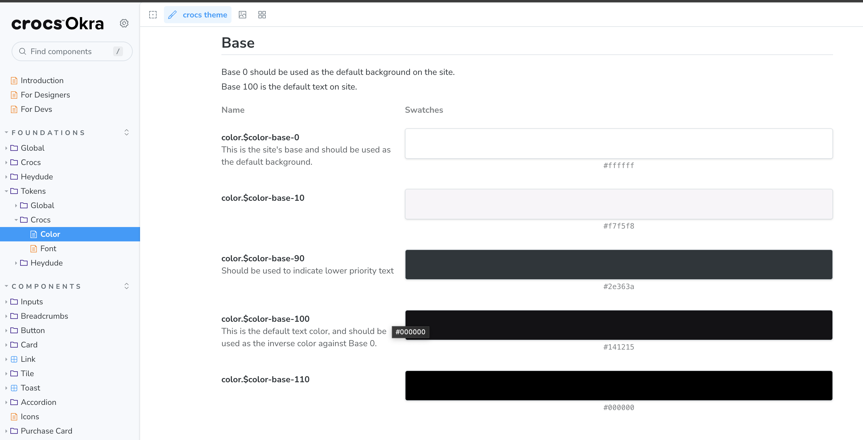
- Design tokens: Color palettes, typography scales, spacing systems, and elevation tokens
- WCAG 2.1 AA compliance: Built accessibility into every component from the start
- Comprehensive documentation: Storybook with separate guides for designers and developers
Key Achievements
Foundational Work
- Architected brand token system enabling seamless multi-brand switching
- Integrated Crocs brand fonts and HeyDude redesign typography
- Established design token preprocessing pipeline
- Defined elevation and spacing systems for both brands
Component Library
- Served as Principal Architect and Release Lead (v1.0.0 → v1.27.0)
- Migrated legacy components with focus on accessibility and flexibility
- Enhanced core components: Button, Link (with forwardRef), Card with Jibbitz picker
- Built specialized components: Upsell, Spotlight (video support), Hype Block (container queries)
Developer Experience
- Published component and icon libraries to npm with MIT licensing
- Implemented CSS Modules migration for scoped styling
- Standardized tooling: Prettier, ESLint, Stylelint
- Created separate documentation paths for designers and developers
Impact & Results
- 27 releases shipped across 18+ months
- 40+ components adopted by design and engineering teams
- 2 brands (Crocs, HeyDude) sharing common foundations
- WCAG 2.1 AA compliance across all components
- npm-published packages enabling external developer integrations
- Improved velocity: Designers and developers working from single source of truth
Resources
What I Learned
Building Okra taught me that great design systems are about bridging the gap between design and development. By investing upfront in shared tokens, clear documentation, and developer experience, we created a tool that multiplied team velocity across multiple brands and geographies.
The multi-brand token system approach (vs. separate codebases) proved especially valuable—it meant that foundational work like typography updates or accessibility improvements could be applied once and immediately benefit all consuming applications.