Crocs DS: Okra
- 20260210
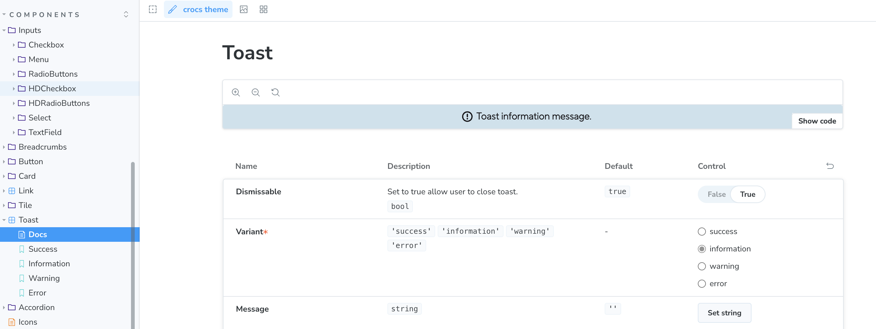
Okra was initiated in August 2023 with a Next.js + Storybook bootstrap and evolved into a multi-brand design system serving Crocs and Heydude. The component library is built with React 18 and SCSS, with design tokens compiled via Style Dictionary and foundations organized per brand. Icons are generated and optimized via SVGR/SVGO, with a dedicated icons library. Documentation is powered by Storybook 7 (MDX/CSF). Bundling uses Webpack for the site and Rollup for library distribution; the repo is standardized with Prettier, Stylelint, and ESLint, adopted CSS Modules, and publishes MIT-licensed packages to npm. Emotion and MUI are used selectively for styling and documentation UI.
info
Adopted across Crocs & HeyDude; 27 releases; 40+ components; WCAG-compliant; npm-published libraries.
Highlights
- Principal Architect and Release lead/maintainer for Okra versions 1.0.0 through 1.27.0.
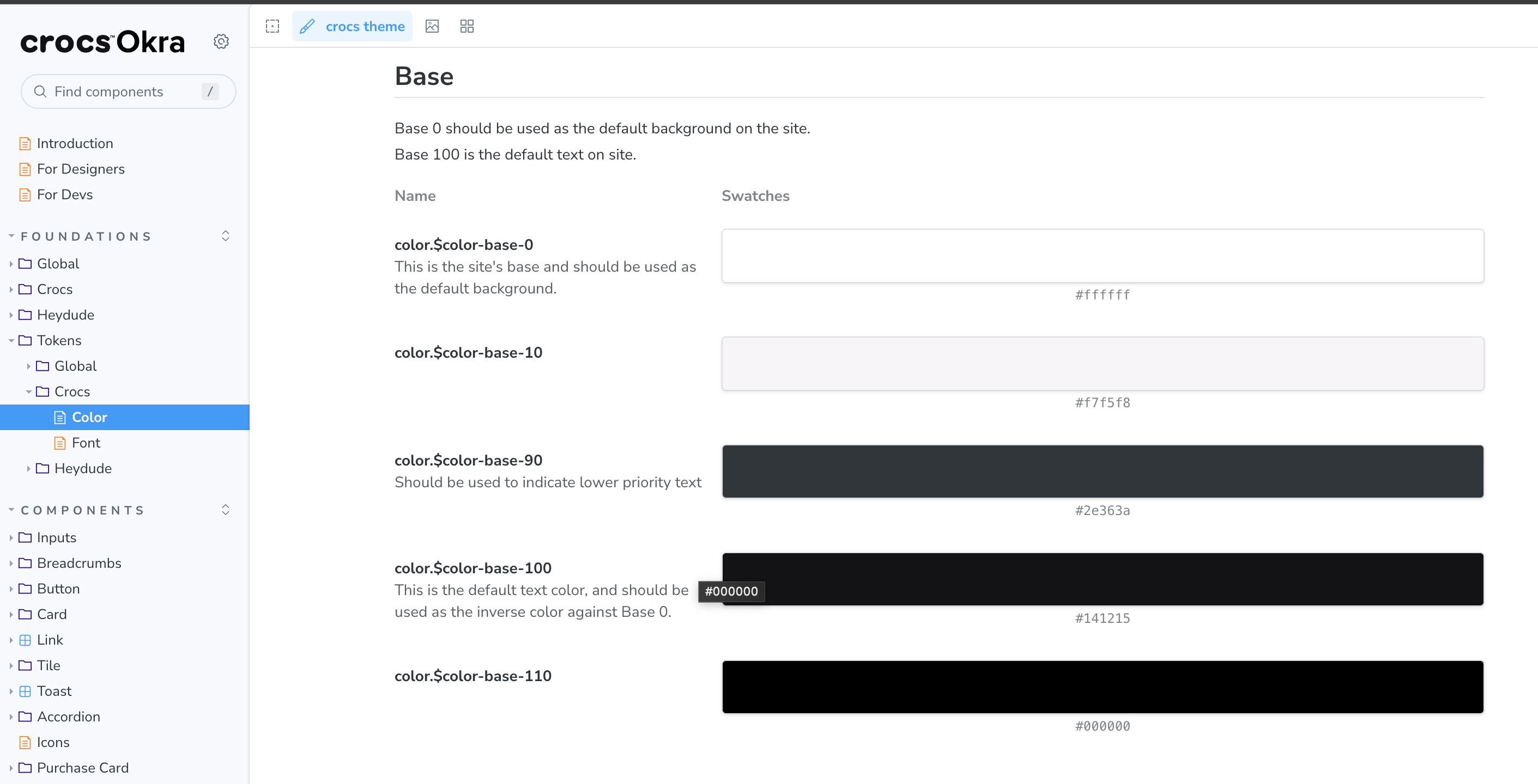
- Major foundations work: Brand typography, tokens and brand switching.
- Ported majority of components into Okra, with a focus on accessibility and flexibility to support multiple brands and global markets.
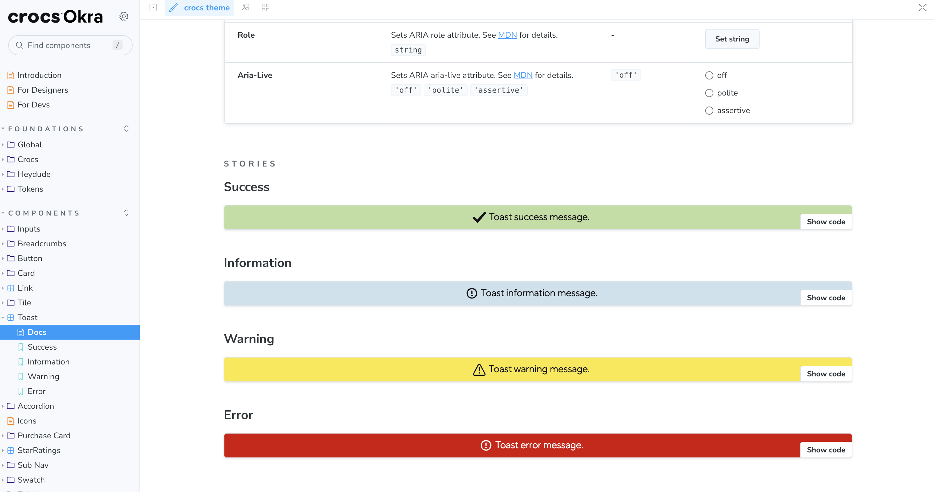
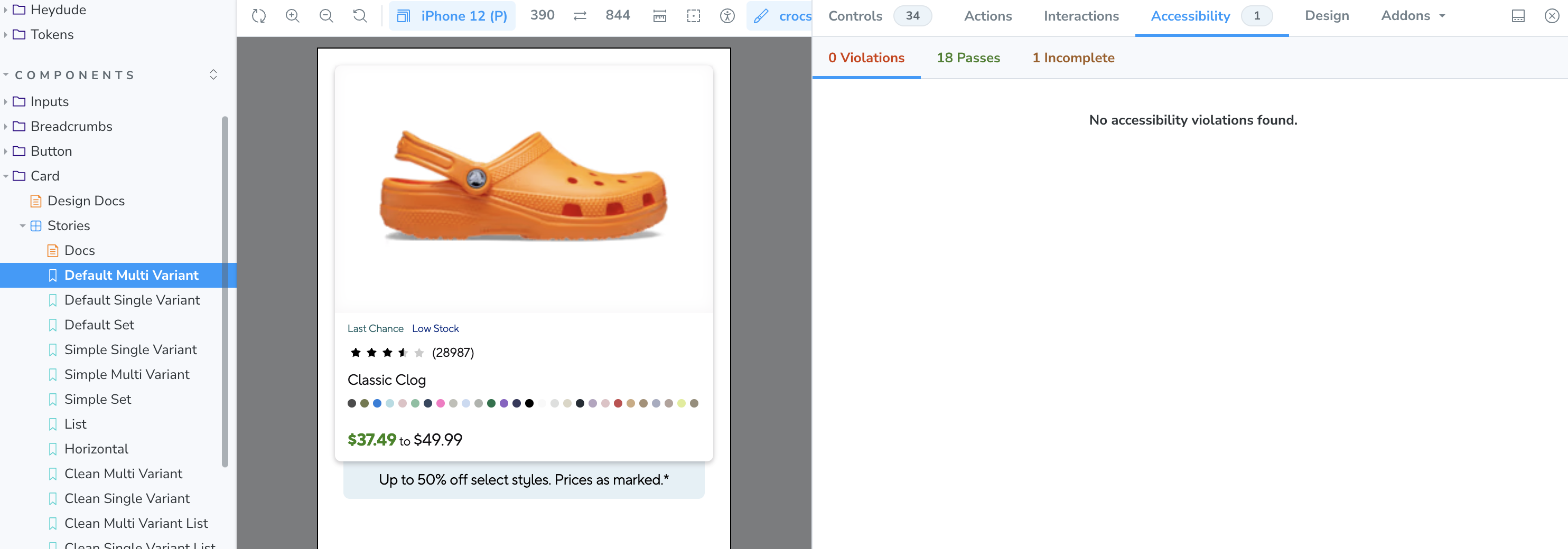
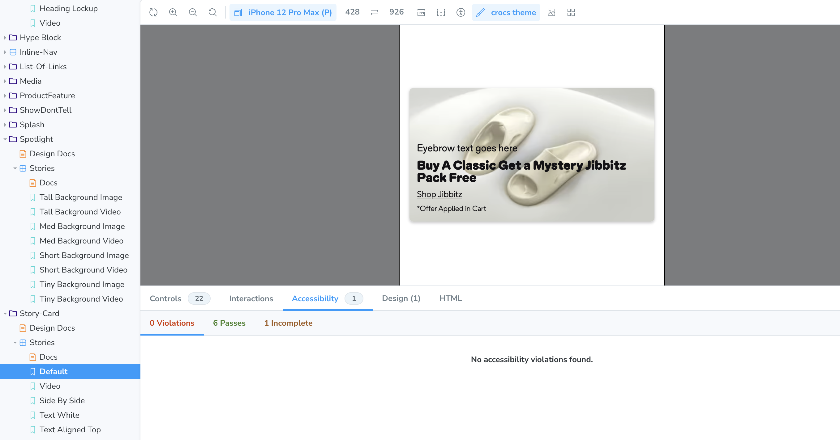
- Component enhancements: Button, Link (forwardRef), Card (Jibbitz picker), Upsell, Spotlight, Hype Block.
- DevEx improvements: Publish component and icon libraries to npm, Prettier, and CSS Modules migration.
Foundations & Tokens
- HeyDude Redesign: Okra Typography — 2025-05-01
- HeyDude Redesign: Okra Elevations — 2025-05-16
- Crocs brand font integration — 2024-09-19
- Preprocess tokens — 2024-08-01
Components & Modules
- OkButton/OkLink forwardRef — 2024-12-04
- Button update (Crocs) — 2024-10-14
- OkCard: add Jibbitz Picker — 2024-08-23
- Upsell: missing subheading — 2024-06-27
- Spotlight: video fixes — 2025-03-04
- Hype Block: container query — 2024-02-16
DevEx & Publishing
- Publish Okra to npm — 2024-03-21
- Add MIT license to NPM libs — 2024-04-05
- Fix Prettier formatting — 2024-03-11
- CSS Modules migration — 2024-07-16